Editorial introduction
This illustrated critical essay examines the visual design of Alice: Madness Returns through Gothic aesthetics, Victorian-inspired costume, colour, character development and environmental storytelling. It considers how concept art and contrasting visual motifs connect fashion, narrative and gameplay. This introduction was prepared by the editorial office; the manuscript itself begins below.
Opening illustration
Introduction
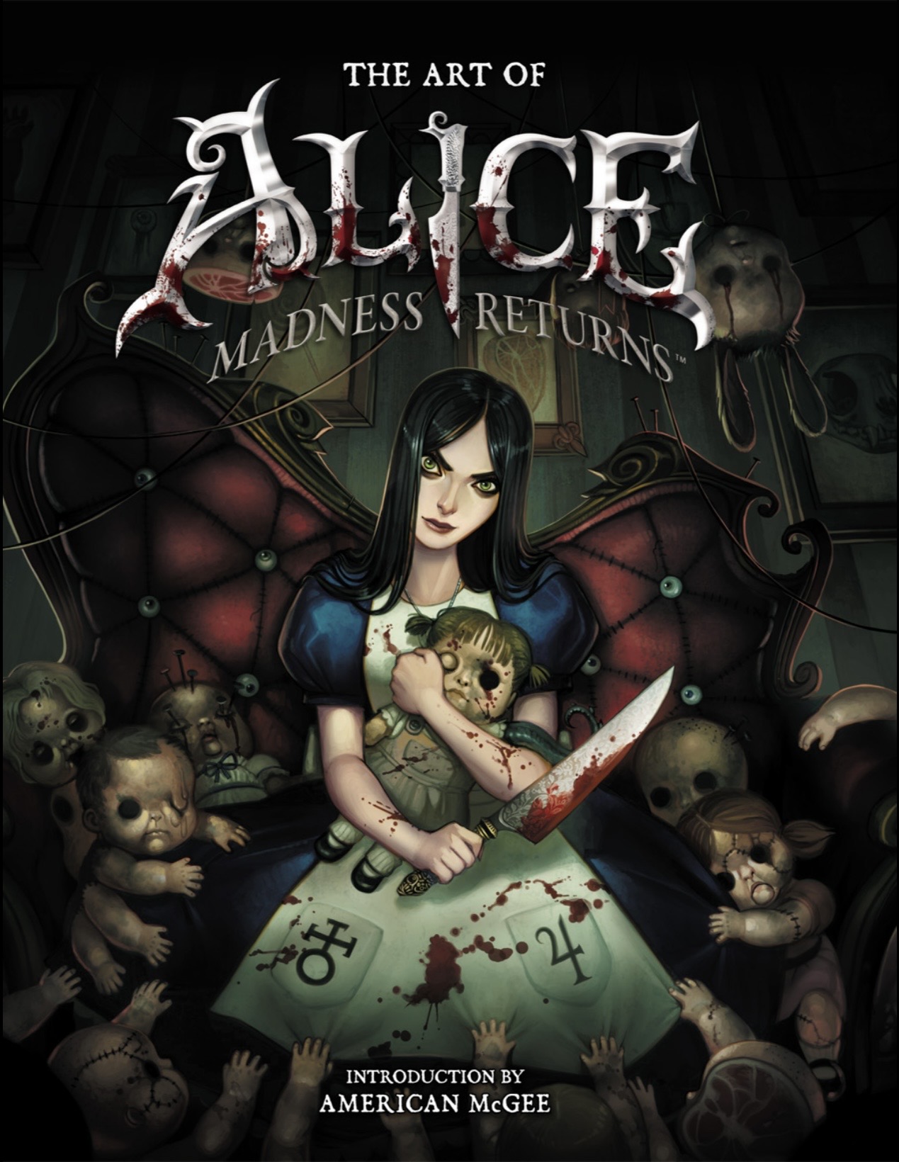
Alice: Madness Returns (2011), developed by Spicy Horse and published by Electronic Arts, is a particularly significant example of how video game design can transform a literary world into a new visual and emotional experience. Rather than simply reproducing Lewis Carroll’s Alice’s Adventures in Wonderland (1865), the game combines Carroll’s characters, motifs and settings with Gothic horror, Victorian fashion, psychological symbolism, steampunk-inspired machinery and grotesque fantasy. The result is a Wonderland that is recognisable but fundamentally altered, colourful yet disturbing, beautiful yet violent, and childish yet psychologically mature.
The game follows Alice Liddell, now a young woman living in Victorian London after surviving the fire that killed her family. Although she has been released from Rutledge Asylum, she continues to experience psychological trauma and returns mentally to Wonderland. However, Wonderland is no longer the refuge it once represented. It has become corrupted, forcing Alice to investigate her memories and confront the forces responsible for her suffering (Electronic Arts, 2011). This relationship between psychological experience and visual design is one of the most important aspects of the game's art direction.
The design of Alice: Madness Returns is particularly interesting from a fashion and visual-design perspective because Alice's clothing changes throughout her journey. Her dresses are not simply decorative costumes as they are connected to the environments she enters, the emotional state of the narrative and the visual identity of different areas of Wonderland. The character designs, silhouettes, materials, colours, accessories and footwear all contribute to the construction of Alice as a Gothic reinterpretation of the traditional Victorian girl.
The concept art images provided for this report demonstrate the development of this visual language. They show alternative versions of Alice's costume, different colour ways, experimental designs and more developed character concepts. In particular, the images demonstrate how the designers experimented with the relationship between the familiar blue-and-white Alice dress and darker, more disturbing variations. The transformation of the classic children's character into a Gothic heroine is therefore not only a narrative decision but also a carefully developed design strategy.
This report examines the art and design of Alice: Madness Returns, focusing on its relationship with Carroll's original work, Gothic aesthetics, Victorian fashion, colour, character design, costume development, environmental design and the relationship between visual design and psychological storytelling. It also considers how the game's production context influenced its distinctive appearance.
1. From Carroll's Wonderland to American McGee's Wonderland
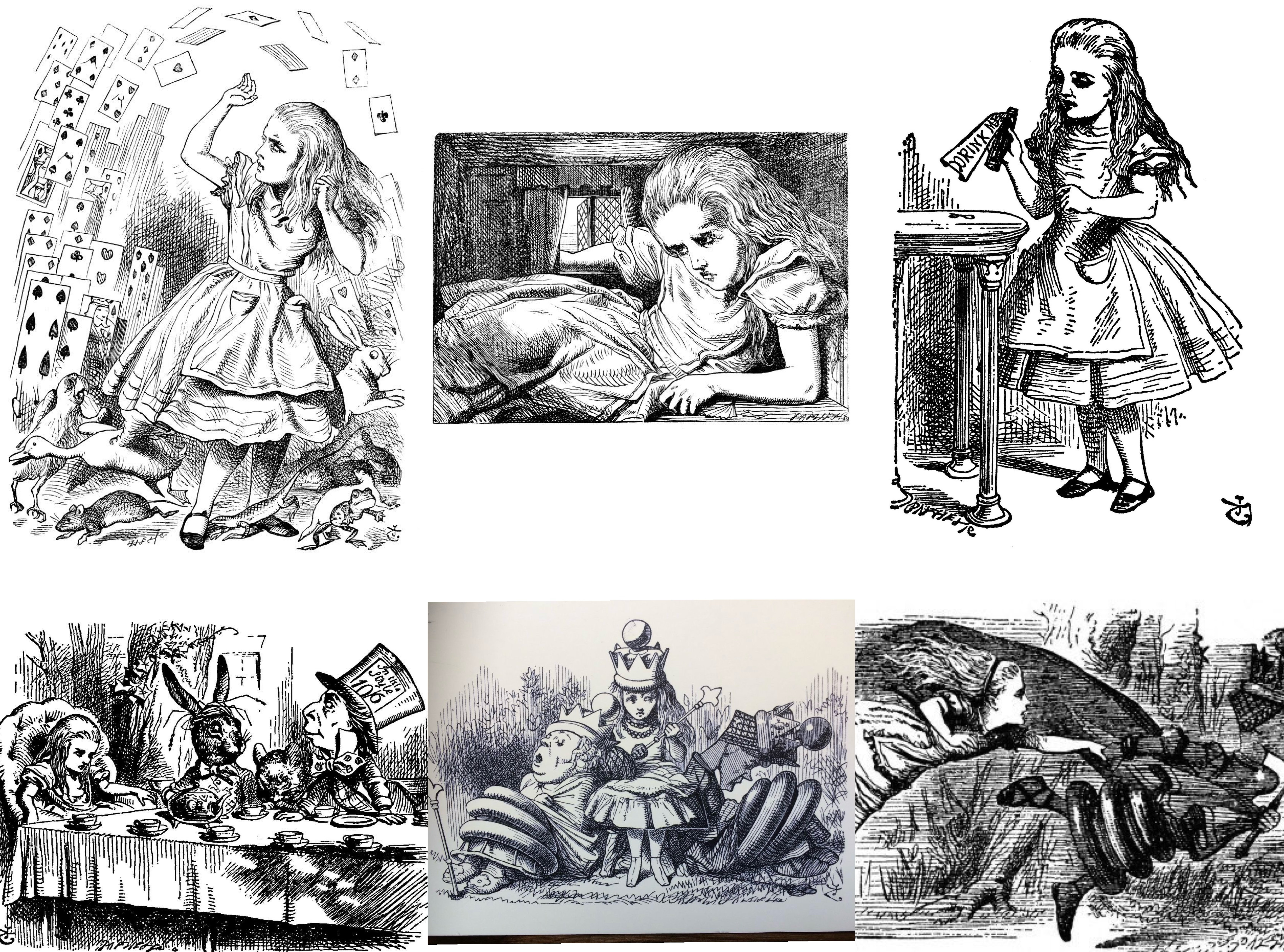
The starting point for understanding Alice: Madness Returns is Lewis Carroll's Alice's Adventures in Wonderland. Published in 1865, Carroll's novel introduced Alice to a world governed by unstable logic, transformations, wordplay and bizarre characters. The story was already visually distinctive through John Tenniel's illustrations, which established many of the appearances that later adaptations would reinterpret (Carroll, 1865). The original Wonderland contains elements that are strange and occasionally unsettling, but its primary tone is playful, absurd, surreal and whimsical
Alice: Madness Returns takes these characteristics and pushes them towards psychological horror. Rather than treating Wonderland as a completely separate fantasy world, the game presents it as a visual representation of Alice's memories, fears and trauma. American McGee explained that one of the important rules during development was that what appeared in Wonderland should originate from Alice's real-world experiences (Ma, 2011). This principle is extremely important to the game's design because it establishes a direct relationship between character psychology and visual world-building.
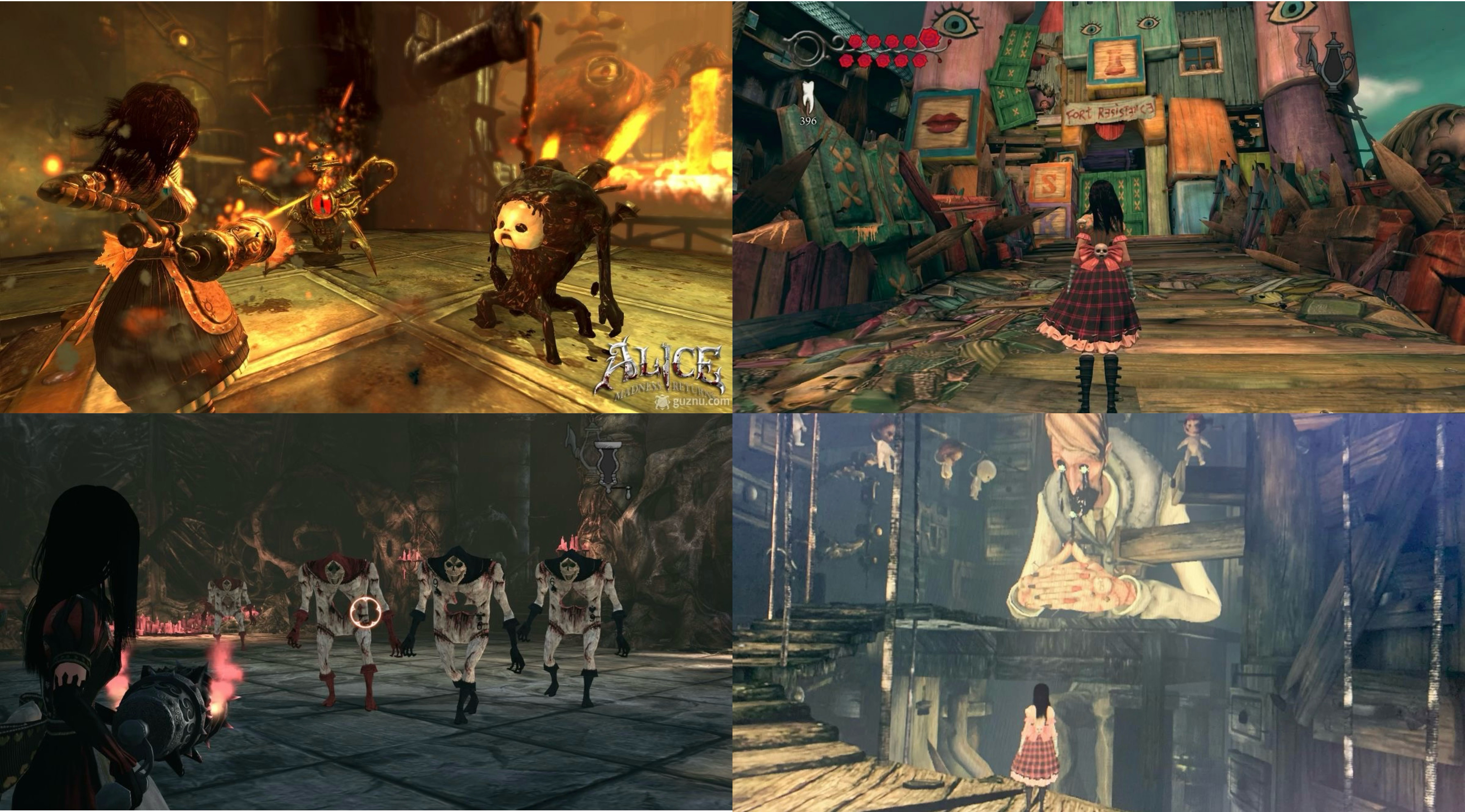
For example, the game's environments do not merely provide backgrounds for combat. They communicate aspects of Alice's mental state. The world changes according to the progression of her memories, with apparently beautiful spaces gradually revealing grotesque or threatening elements. The contrast between beauty and horror becomes one of the game's defining visual characteristics.
The relationship between the original literary material and the video game is therefore one of reinterpretation rather than direct illustration. Carroll's Wonderland provides the foundation, while McGee's interpretation adds Victorian Gothic horror and psychological symbolism. The game uses familiar figures such as the Mad Hatter, Cheshire Cat and Queen of Hearts but transforms their visual identities to fit its darker narrative.
This approach also reflects the fact that Madness Returns is a sequel to American McGee's Alice (2000), rather than a direct adaptation of Carroll's book. The 2011 game continues the visual and narrative language established by the first game while expanding it into a more detailed three-dimensional world. Electronic Arts described the game as building on the original's distinctive art style while introducing new visuals, story and game design (Electronic Arts, 2011).
2. Gothic Aesthetics and the Visual Language of Horror
One of the strongest characteristics of Alice: Madness Returns is its use of Gothic aesthetics. Gothic design traditionally relies on contrasts such as beauty and decay, innocence and violence, life and death, and the familiar and unfamiliar. These contrasts are particularly effective in Madness Returns because Alice herself embodies them.
Alice appears young, delicate and associated with childhood, yet she carries weapons and fights grotesque creatures. Her dresses frequently use traditionally feminine silhouettes, including fitted bodices, puffed sleeves, aprons and full skirts. However, these elements are combined with bloodstains, skulls, heavy boots, buckles, dark colours and weapons.
This creates a deliberate contradiction. Alice looks like a Victorian girl while simultaneously looking like a Gothic warrior.
Kara M. Kvaran argues that McGee's Alice combines the visual identity of the familiar child character with Gothic fashion and violence. The contrast between the young girl's dress and her weapons produces an image that is simultaneously innocent and dangerous (Kohlke, 2012). This contradiction is central to the visual identity of the character.
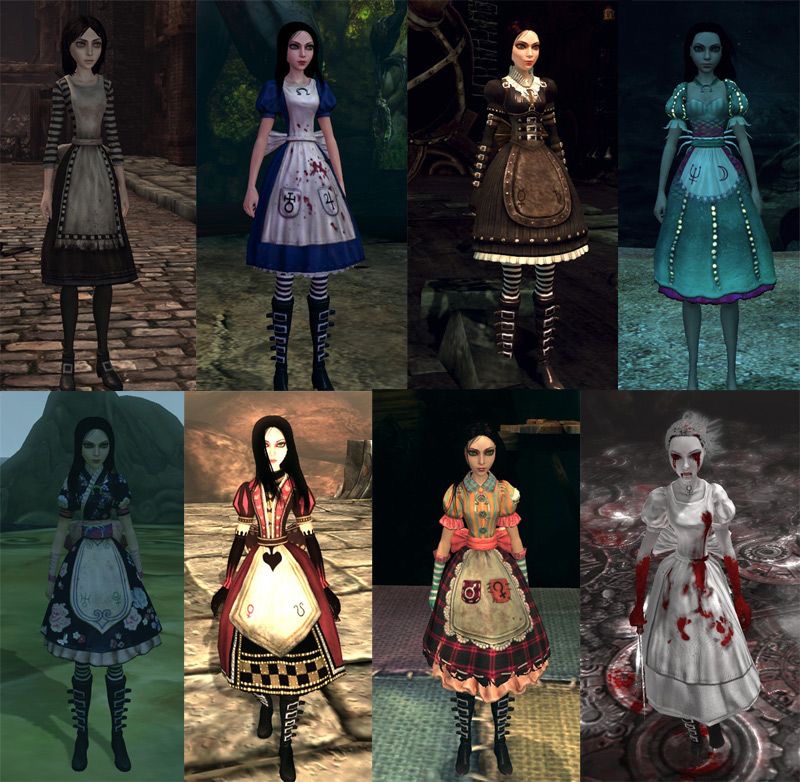
The image shown above demonstrates this transformation particularly clearly. The concept artwork shows several versions of Alice, ranging from the recognisable blue-and-white dress to darker and more elaborate designs. The classic blue dress is still identifiable, but its relationship with the blood-covered apron, striped stockings and heavy boots changes the meaning of the original silhouette.
The boots are particularly important. Traditional representations of Alice often emphasise the softness and simplicity of a child's dress. In Madness Returns, the boots introduce weight and aggression. Buckles, straps and dark leather create a harder visual language. They make Alice appear capable of physically confronting the hostile world around her.
The knife is similarly significant. The Vorpal Blade is not simply a weapon added to make the game playable. It becomes part of Alice's character identity. The image of a girl in a Victorian dress holding a large bloodstained blade is immediately recognisable as a deliberate inversion of the traditional Alice image.
3. Costume Design as Character Development
Costume is arguably one of the most important design systems in Alice: Madness Returns. Alice wears multiple dresses throughout the game, and each costume relates to a particular environment or stage of her journey. This makes clothing part of the game's visual storytelling.
The classic costume retains the strongest connection to Carroll's Alice. It consists of a blue dress, white apron, striped stockings and black boots. However, the design is considerably darker than traditional representations. The apron is stained with blood, while the boots and accessories introduce Gothic elements.
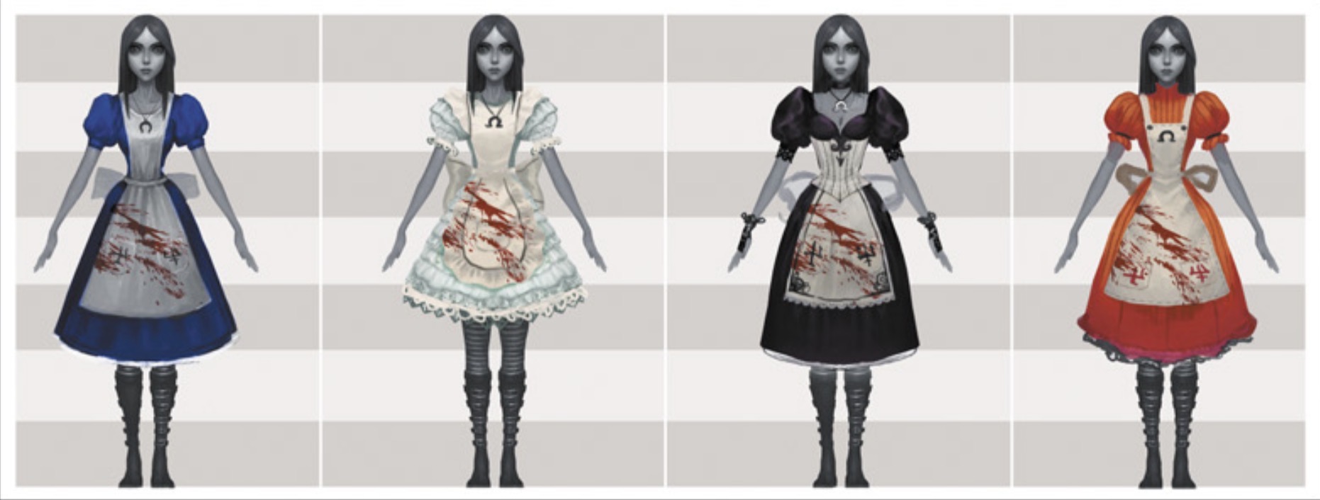
This image above shows several variations of Alice's basic costume. This is useful for understanding how the designers explored colour and silhouette. The same fundamental structure can be transformed through colour: blue, pale green, black and red each produce a different emotional impression.
The blue version is closest to the cultural image of Alice. Blue communicates familiarity and innocence, which makes the bloodstained apron more disturbing. The pale green version feels softer and more dreamlike, while the black version is immediately associated with Gothic fashion and death. The red version is more aggressive and visually intense.
These variations demonstrate an important principle of costume design: colour can alter the psychological meaning of an otherwise similar silhouette.
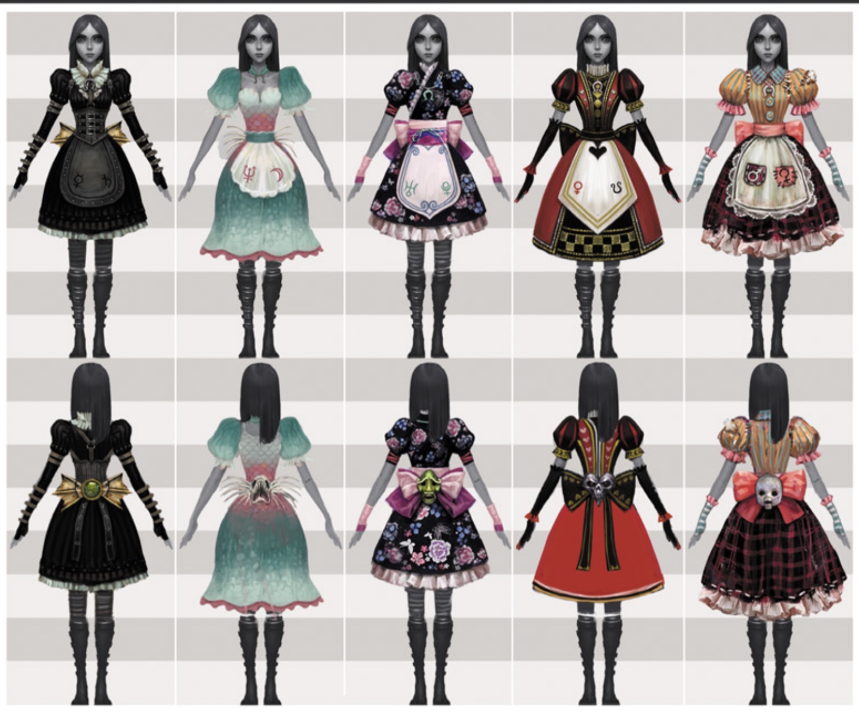
The game's more developed costume designs take this further. This image shows multiple front and back views of Alice's costumes. The costumes contain details such as corsetry, decorative bows, aprons, layered skirts, puff sleeves, patterned fabrics and large back details. This indicates that the character was considered from multiple viewpoints rather than simply designed for a frontal image.
This is particularly important in a third-person video game. The player spends considerable time viewing Alice from behind, meaning the back of the costume is almost as important as the front. Large bows, belts, layered skirts and contrasting panels therefore help create visual interest during gameplay.
The costumes also demonstrate an understanding of silhouette. Alice's body is generally constructed through a fitted upper section and a fuller skirt. This creates an instantly recognisable hourglass-like outline while retaining a connection with Victorian dress.
The use of corset-like bodices is especially important because corsetry is historically associated with Victorian and nineteenth-century women's fashion. However, the game exaggerates and stylises these elements rather than attempting to produce historically accurate clothing. This is consistent with the game's broader approach: historical references are used as a foundation for fantasy rather than as strict reconstruction.
4. Victorian Fashion and Steampunk Influences
Although Alice: Madness Returns is not purely a steampunk game, steampunk aesthetics influence many aspects of its visual language. Mechanical objects, brass surfaces, industrial structures, gears, pipes and elaborate machinery frequently appear throughout Wonderland.
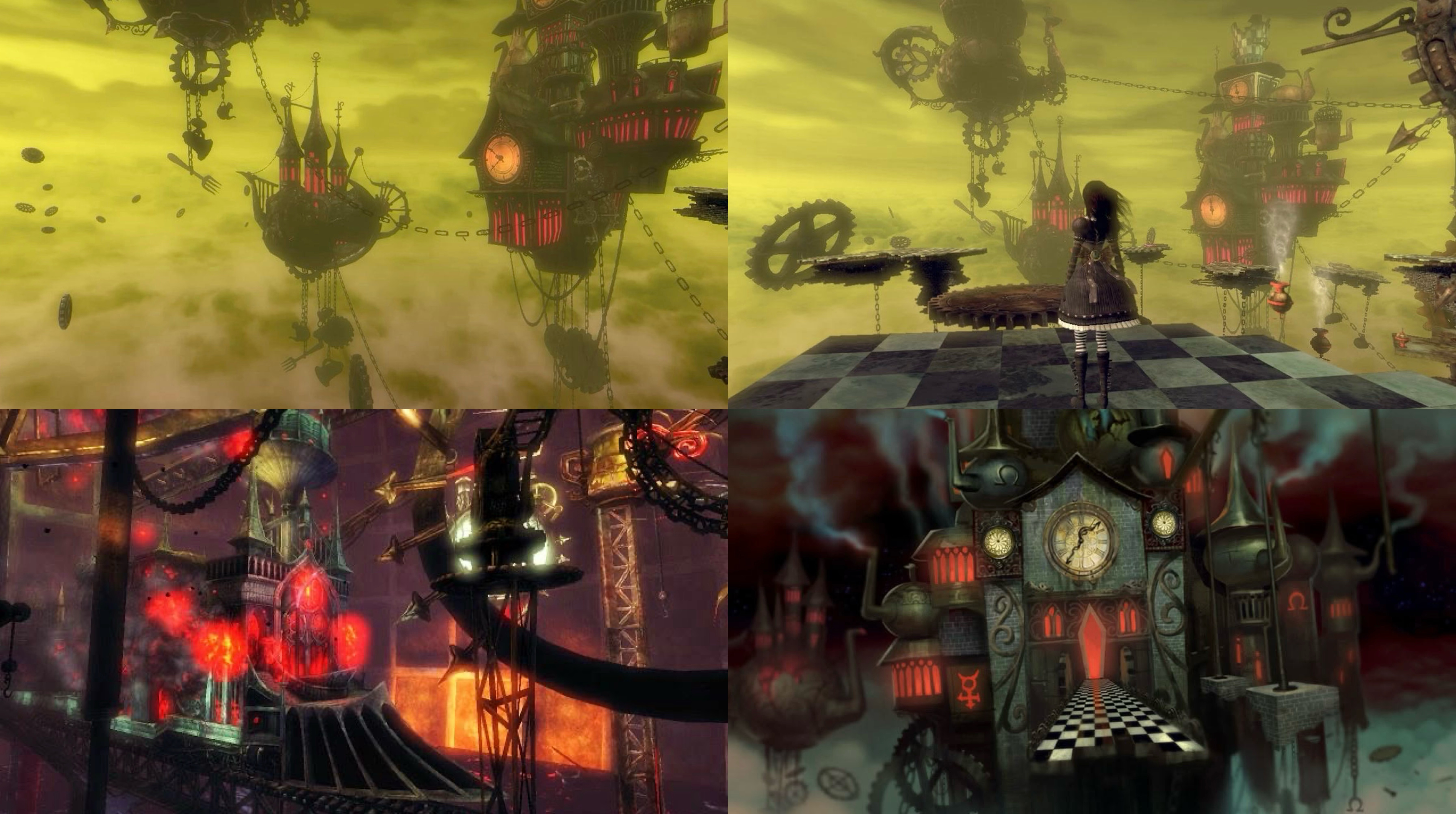
This is particularly noticeable in the Mad Hatter's environment. The human body becomes connected with machines, producing an unsettling combination of flesh and technology. The resulting aesthetic can be understood through the Gothic tradition of transforming familiar objects into disturbing forms.
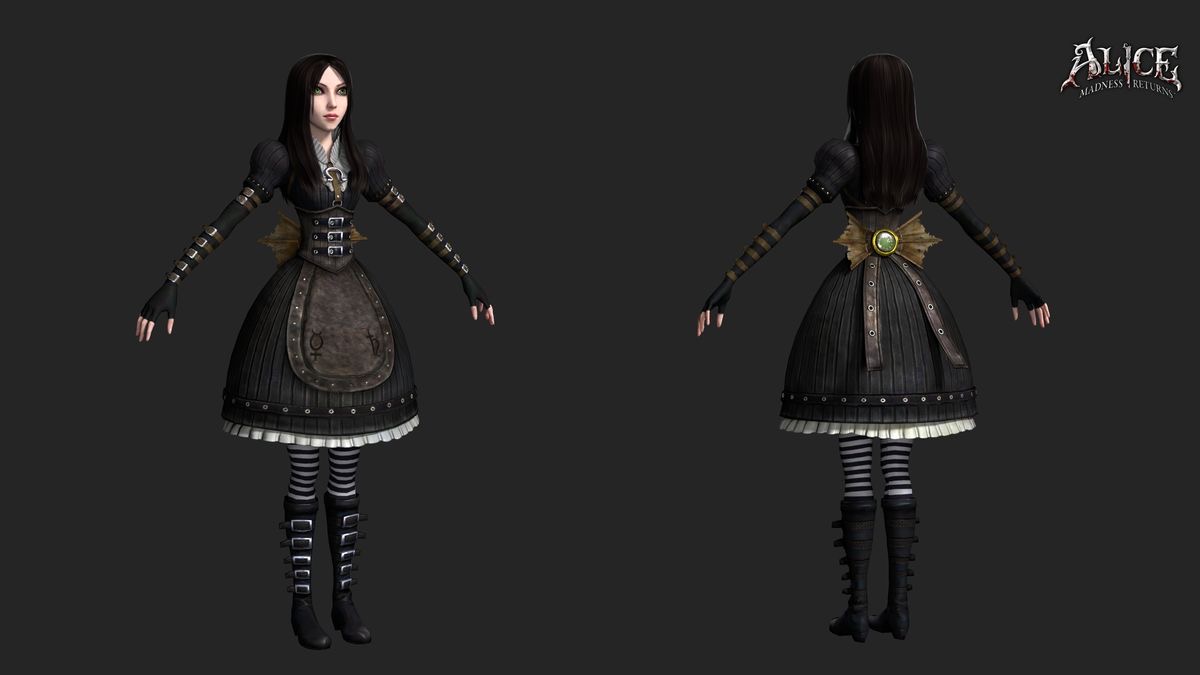
The costume designs also reflect this mechanical influence. Belts, buckles, metal details, structured bodices and heavy boots create a relationship between Alice's body and the industrial world around her. A fashion interpretation of the game can therefore identify three major influences:
- Victorian dress
- Gothic fashion
- Steampunk/industrial designs
These influences are layered rather than isolated.
The dresses shown in the supplied concept images demonstrate this particularly well. The basic Victorian silhouette remains consistent, but the designers add exaggerated bows, mechanical details, unusual textures and symbolic motifs. The result is a fictional fashion system that feels historically inspired without belonging to a specific historical period.
This distinction is important. The purpose of the costumes is not to recreate an authentic Victorian wardrobe. Instead, the designers use selected historical features to communicate character and atmosphere.
The game's art direction was also recognised during its release. American McGee reported that Alice: Madness Returns received a 2011 award for Best Art Direction and described the substantial involvement of artists and outsourcing teams in producing the game's visual assets (McGee, 2011). The development team included a significant art department, with concept artists, animators, 3D artists and effects artists working alongside external studios.
The production context is particularly relevant because Madness Returns was developed primarily by Spicy Horse in Shanghai. McGee later described the project as an important example of a Western AAA console game developed primarily in China by a predominantly Chinese development team (McGee, 2020). This makes the game's visual production history significant within the wider history of videogame art.
5. Colour and Emotional Design
Colour is one of the most powerful tools used in Alice: Madness Returns. Rather than maintaining a single palette throughout the game, the designers use different colour systems to distinguish locations and emotional states.
Wonderland frequently contains extremely saturated colours. Bright reds, blues, greens and purples can appear alongside black, grey and white. This creates a visual contradiction between fantasy and horror.
Red is particularly significant. It represents blood, violence and danger but is also associated with the Queen of Hearts and the imagery of roses. The game repeatedly uses red as a visual warning. Blood on Alice's clothing creates an immediate connection between her body and violence.
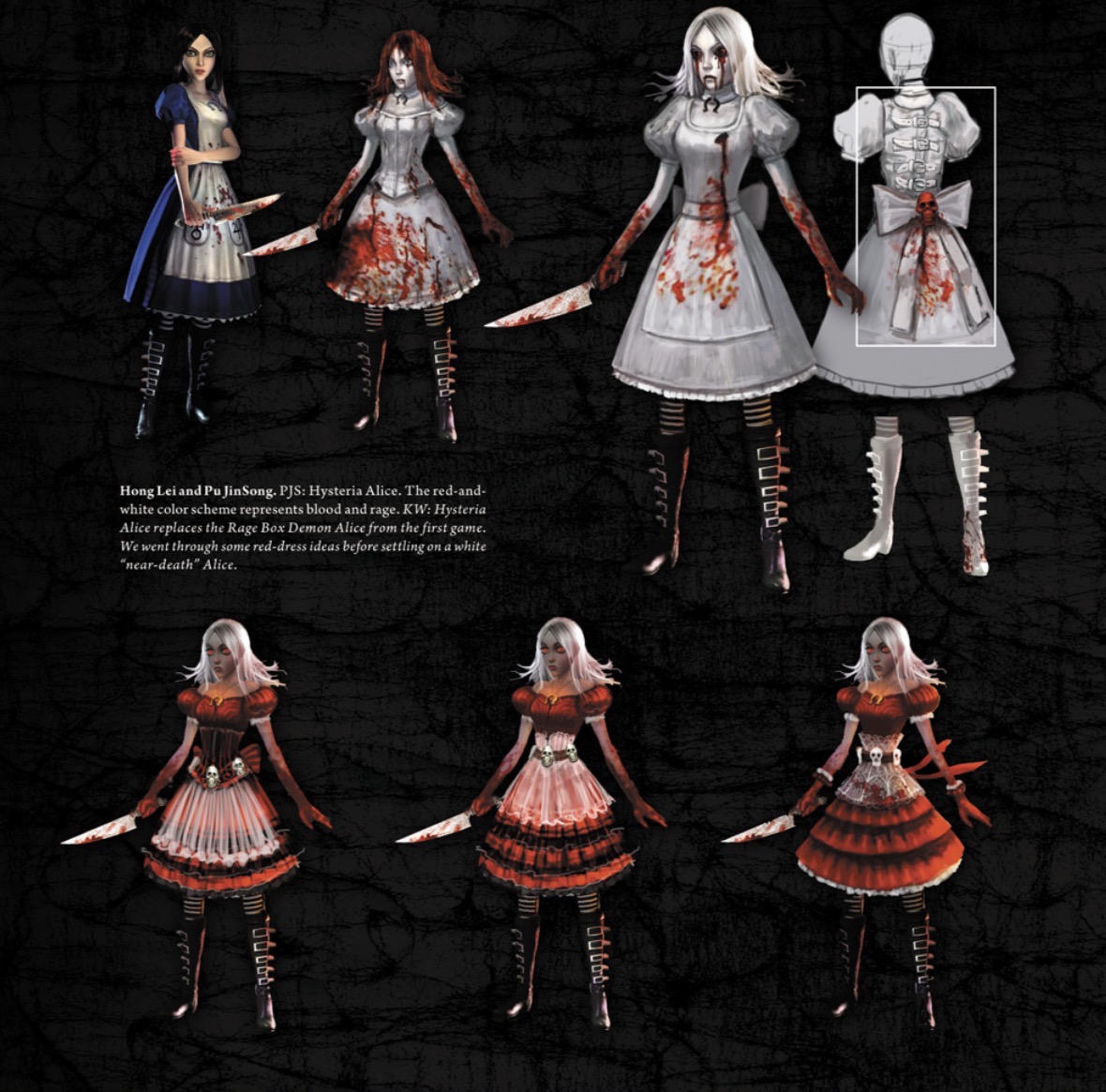
The concept art provided demonstrates how red was gradually incorporated into Alice's costume language. Figure 1 includes red-and-white designs as well as completely red dresses. The contrast between white fabric and red marks is particularly effective because white traditionally suggests purity or innocence. Once stained with red, the same garment becomes evidence of violence.
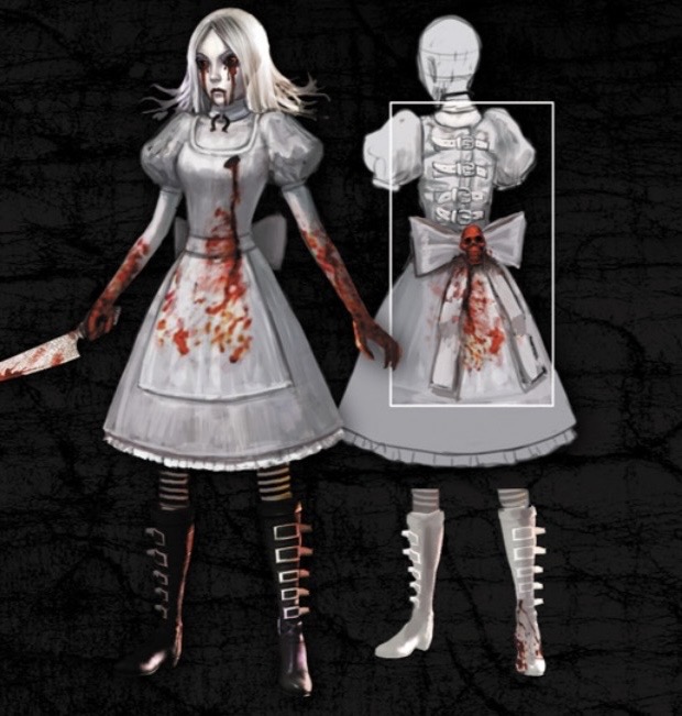
The design notes visible in the supplied concept artwork are particularly useful because they describe the red-and-white colour scheme as representing “blood and rage”. This demonstrates that colour was not an accidental surface choice but part of the conceptual design process.
Black functions differently. Black costumes create associations with death, mystery and Gothic fashion. White also has an important role. In Madness Returns, white can represent innocence, childhood and fragility, but it can also become disturbing when combined with blood. This makes the colour particularly appropriate for a game concerned with corrupted childhood memories.
The contrast between bright fantasy colours and darker Gothic tones also reflects the psychological structure of the game. Alice's Wonderland can be visually attractive at the same time that it is horrifying. The player is encouraged to explore beautiful spaces even when those spaces are dangerous.
6. Character Design and the Construction of Alice
Alice herself is the central visual element of the game. Her appearance needed to balance several contradictory requirements: she needed to remain recognisable as Alice, but she also needed to look older, darker and capable of fighting.
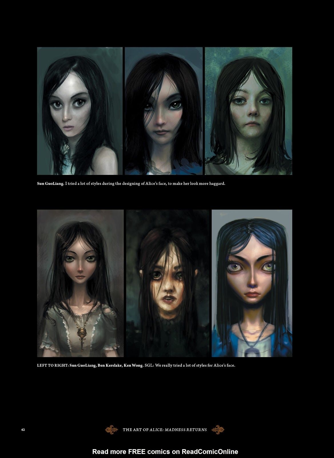
According to McGee, the development team struggled considerably with Alice's face. Ken Wong directed numerous studies by different artists exploring painterly, photorealistic and caricatured approaches before the final direction was established (McGee, 2020). This demonstrates that character design was not a straightforward process.
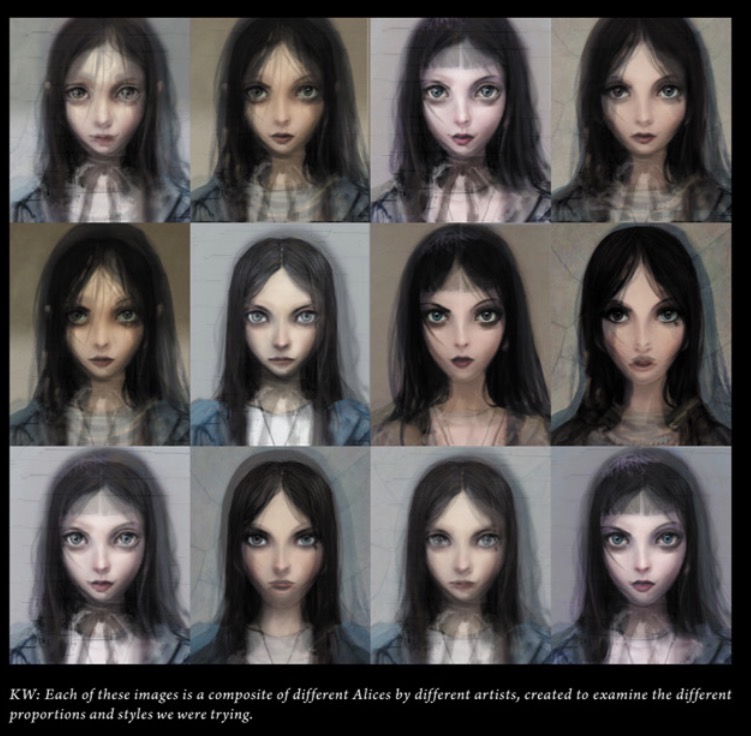
The face is especially important because Alice is the player's primary connection to the narrative. Her expression must communicate vulnerability, determination and emotional distance without becoming overly realistic.
The final design uses exaggerated proportions and pale skin, dark hair and large eyes. These characteristics maintain a connection with the visual language of illustrated fantasy while making Alice appear uncanny.
The contrast between Alice's face and clothing is also important. Her pale skin creates a strong relationship with the white elements of her costume. The dark hair and boots frame the body with darker visual shapes, while red blood creates accent points.
The character designs of Wonderland similarly rely on exaggeration. Enemies are often based on familiar objects or figures that have been transformed into grotesque creatures. The result is a visual system in which the ordinary becomes threatening.
This approach follows Carroll's original method of making familiar ideas strange. Carroll transformed everyday Victorian experiences into absurd creatures, games and situations. McGee takes a similar conceptual approach but changes the emotional tone from nonsense to horror.
7. Environment as Psychological Landscape
The game's environments are arguably as important as its characters. Each Wonderland domain has its own visual identity, and the environments frequently externalise Alice's memories and emotions.
McGee stated that the content of Wonderland was driven by Alice's character and that the development team attempted to ensure that experiences from the real world could be translated into fantastic imagery (Ma, 2011). This gives the environments a psychological function.
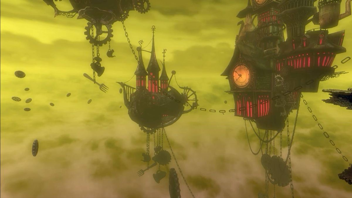
The Hatter's Domain, for example, combines Victorian industrial machinery with grotesque body imagery. The result reflects themes of control, transformation and exploitation.
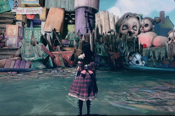
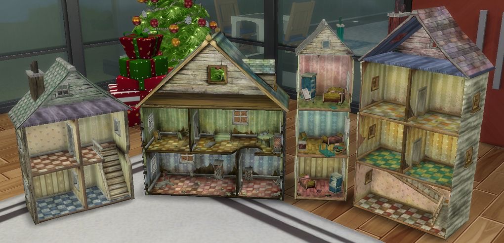
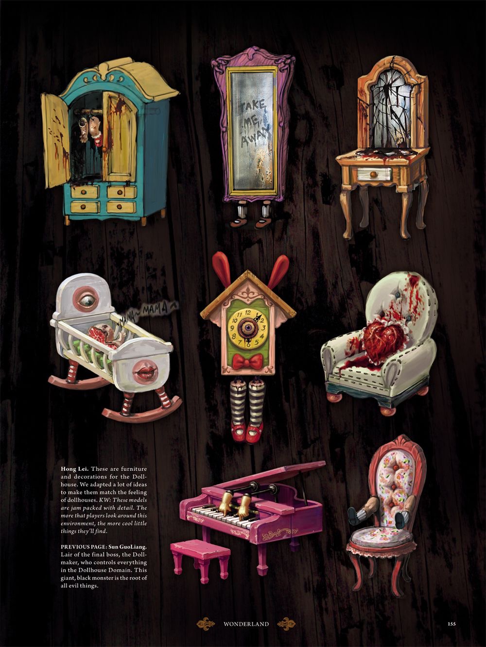
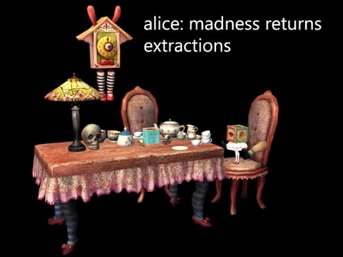
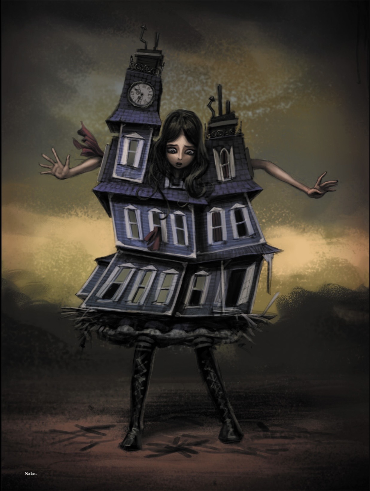
The Dollhouse is similarly disturbing because an object associated with childhood and play becomes a place of horror. This transformation of childhood objects is particularly effective because it challenges the assumption that childhood imagery must be innocent. Dolls, toys, playing cards, tea parties and dresses are all familiar elements of Alice's cultural identity, but the game reconfigures them into disturbing forms.
The visual relationship between environment and costume reinforces this process. Alice's dress changes depending on the world she enters, creating a form of visual continuity between character and environment.
This is comparable to fashion styling in film or editorial photography, where costume can be used to integrate a model into a particular visual world. In Madness Returns, however, the relationship is interactive because the player physically moves the character through the environment.
8. Concept Art and the Design Development Process
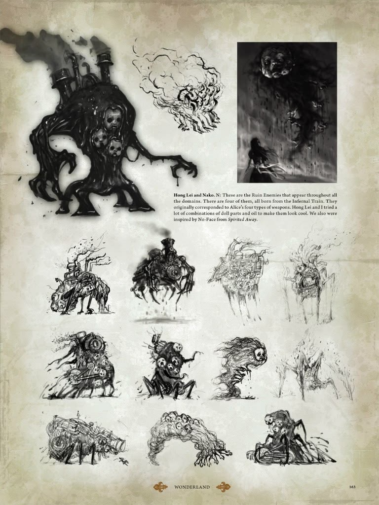
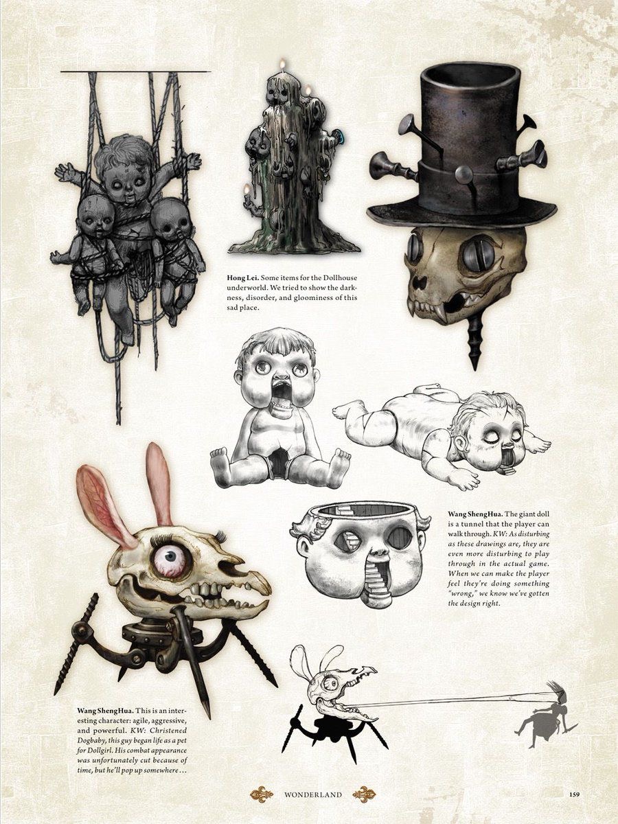
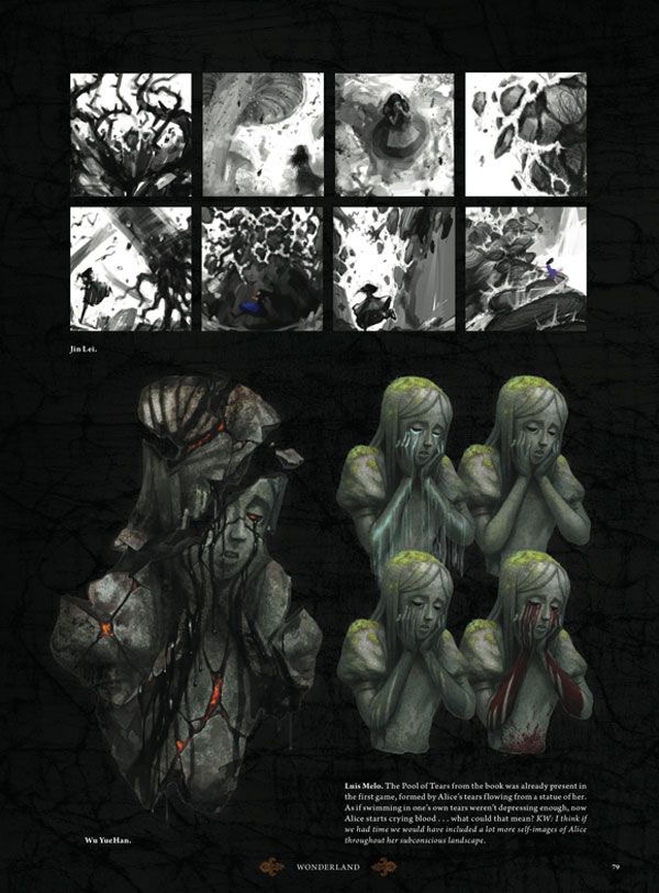
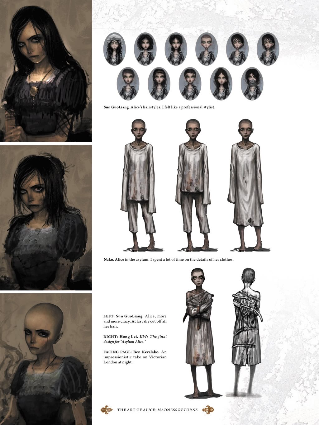
The supplied images are particularly valuable because they reveal the development process behind the final game. Concept art is important in video game production because it allows designers to explore visual possibilities before committing resources to full 3D production.
The existence of these experiments is consistent with the development material released by McGee, which includes art and layout documents, visual-effects designs, maps and other pre-production materials from Madness Returns (McGee, 2019). This demonstrates that the game's visual identity emerged from an extensive process of iteration.
McGee has also described the difficulty of establishing Alice's appearance, explaining that many different artists had competing interpretations of what Alice should look like (McGee, 2020). This is significant because it shows that concept art is not simply a record of a final design. It is part of the creative negotiation through which a visual identity is established.
The supplied concept images should therefore be understood as evidence of design development rather than merely promotional illustrations.
9. The Relationship Between Fashion and Gameplay
A major difference between costume design in video games and costume design in static media is that clothing exists within an interactive system.
In Alice: Madness Returns, costumes contribute to the player's understanding of Alice's progression. The dresses are associated with different Wonderland environments and can also provide gameplay-related effects. This creates a direct connection between aesthetics and function.
This is important because good video game design often attempts to integrate visual and mechanical systems. A costume should ideally communicate something about the character while also functioning within the game.
Alice's clothing also affects the way the player reads her movement. The wide skirts create a strong silhouette during running, jumping and combat. The contrast between the skirt and boots makes her movements easier to distinguish against the environment.
The oversized silhouette is therefore not purely decorative. It contributes to visual readability.
The weapons work similarly. Alice's weapons are deliberately based on objects that relate to the world of Wonderland. The pepper grinder, teapot and knife become weapons, creating a humorous but unsettling relationship between domestic objects and violence. Engadget's contemporary coverage highlighted this transformation, describing Alice using a pepper grinder as a Gatling-style weapon while fighting grotesque enemies (Fletcher, 2010).
This approach is consistent with the game's central design philosophy: familiar objects are transformed into unfamiliar functions.
10. The Importance of Contrast
The strongest principle connecting the art and design of Alice: Madness Returns is contrast.
The game repeatedly combines:
- childhood and adulthood;
- beauty and horror;
- innocence and violence;
- Victorian fashion and fantasy;
- organic forms and machinery;
- reality and imagination;
- femininity and aggression;
- colour and darkness.
Alice's costume is a perfect example. The dress communicates femininity and childhood, while the boots, weapons and blood communicate violence. Neither side completely replaces the other.
The same principle appears in Wonderland itself. A beautiful landscape may contain grotesque creatures. A children's toy may become threatening. A tea party can become a scene of horror.
This strategy allows the game to remain visually attractive without becoming conventional fantasy. The horror is made more effective because it exists inside beautiful imagery.
Contemporary criticism of the game has similarly identified its art direction as one of its defining qualities, particularly its contrast between gloomy Victorian London and colourful but dangerous Wonderland (Barker, 2011). This contrast is not simply aesthetic; it communicates the division between Alice's external reality and internal psychological world.
Conclusion
Alice: Madness Returns demonstrates how video game art and design can transform an established literary character into a new visual identity. Rather than simply reproducing Lewis Carroll's Wonderland, American McGee and the Spicy Horse team reinterpret its characters, objects and environments through Gothic horror, Victorian fashion, steampunk aesthetics and psychological symbolism.
The game's costume design is particularly successful because it combines recognisable references with original visual development. Alice's blue dress and white apron maintain the cultural identity established by Carroll, while bloodstains, Gothic boots, weapons, corsetry, buckles and darker colour palettes transform her into a contemporary Gothic heroine. The different dresses shown in the supplied concept artwork demonstrate how colour, silhouette and decoration were explored to create different versions of the same character.
The use of colour is equally important. Blue communicates familiarity and innocence; white creates associations with purity and childhood; red introduces violence, blood and rage; while black establishes a Gothic atmosphere. By combining these colours, the designers create a visual language in which beauty and horror exist simultaneously.
The concept-art development process also demonstrates the complexity of videogame design. The final Alice was not produced through a single straightforward idea. Multiple artists explored different faces, costumes, colours and styles before the final visual identity was established. McGee's later discussion of the development process confirms that considerable experimentation was required to determine how Alice should look (McGee, 2020).
Ultimately, the art of Alice: Madness Returns is effective because the visual design is inseparable from the narrative. The environments represent Alice's psychological condition, the costumes reflect different stages and aspects of her journey, and familiar objects are transformed into weapons and monsters. The game's visual identity is therefore not simply “dark Alice in Wonderland.” It is a coherent design system in which fashion, architecture, colour, character design and gameplay all contribute to the same central themes of memory, trauma, identity and transformation.
From a fashion-design perspective, Alice: Madness Returns is particularly valuable because it demonstrates how historical references can be transformed rather than copied. Victorian silhouettes become Gothic silhouettes; children's clothing becomes armour; domestic objects become weapons; and decorative details become symbols of psychological change. The result is a visual world that remains recognisably Alice while creating an identity that is distinctly American McGee's.
The continuing interest in the game's visual style is evidence of the strength of this approach. Its concept art, costume variations and environmental designs demonstrate how a strong visual concept can create an entire world rather than simply decorate one. Alice: Madness Returns therefore provides an important case study in the relationship between fashion, character, narrative and world-building in contemporary video game design.
References
Barker, S. (2011) ‘Alice: Madness Returns Review’, Push Square, 22 June. Push Square (Accessed: 15 September 2026). Source
Carroll, L. (1865) Alice's Adventures in Wonderland. London: Macmillan. Project Gutenberg edition(Accessed: 15 September 2026). (Project Gutenberg) Source
Electronic Arts (2011) ‘Alice: Madness Returns Drops Players into Terrifying, Beautiful Wonderland Today’, 14 June.Electronic Arts (Accessed: 15 September 2026). Source
Fletcher, J.C. (2010) ‘American McGee on bringing Alice's madness back’, Engadget, 29 September. Engadget (Accessed: 15 September 2026). Source
Kohlke, M.-L. (2012) ‘“But I’m grown up now”: Alice in Wonderland and the Gothic’, Neo-Victorian Studies, 5(1), pp. 183–214.
Ma, R. (2011) ‘Alice: Madness Returns – American McGee Interview’, Capsule Computers, 27 May.Capsule Computers (Accessed: 15 September 2026). Source
McGee, A. (2011) ‘“Best Art Direction” for Alice: Madness Returns’, American McGee's Blog, 15 December.American McGee's Blog (Accessed: 15 September 2026). Source
McGee, A. (2019) “Madness Returns” Design Materials’, American McGee's Blog, 17 June. American McGee's Blog (Accessed: 15 September 2026). (americanmcgee.com) Source
McGee, A. (2020) ‘A Picture of The Mind ’, American McGee's Blog, 15 June. American McGee's Blog (Accessed: 15 September 2026). (americanmcgee.com) Source
McGee, A. (2020) ‘The Art of Alice: Madness Returns’, American McGee's Blog, 14 June.American McGee's Blog (Accessed: 15 September 2026). (americanmcgee.com) Source
McGee, A. (ed.) (2011) The Art of Alice: Madness Returns. Milwaukie, OR: Dark Horse Books. (Google Books) Source
The Style of American McGee's Alice Games (Accessed: 15 September 2026). https://youtu.be/m12tI8ax5LU?si=Bk-u0wYMCuQ3G-tJ Source
Publication record
- Article ID
- ODCS-V0-006
- Received
- 2026.09.15
- First posted
- 2026.09.15
- Final editorial decision
- 2026.09.28
- Language
- English
- Status
- Final published edition (original submission); editorial decision, not independent peer review
- Text-only archive DOI
- 10.5281/zenodo.23018205
Editorial decision: this is the final published version. Earlier screening notes and signed comments remain dated records; publication does not imply independent peer review.
Citation
SU PAN. (2026). The Art and Design of American McGee’s Alice: Madness Returns. Open Design & Card Studies. DOI: https://doi.org/10.5281/zenodo.23018205.
The Zenodo DOI identifies the separate text-only archival PDF. It does not include or license the game-art illustrations displayed on this page.
Earlier editorial note
Published as an illustrated critical essay, not as a completed independently peer-reviewed research article. SU PAN is the sole author and has agreed to full-text publication of her contribution under CC BY-NC 4.0. After receiving the editorial screening comments, the author elected to retain the original submission as the final edition. The submitted English prose, 22 illustrations and 12 reference entries are retained. Section and list numbering, an obvious stray letter, and hyperlink formatting were tidied for web reading. Illustration labels are editorial navigation aids; the original figure cross-references still require clarification. Third-party game artwork is not covered by the author's CC licence and remains subject to its respective rights. Source accuracy and image credits remain open editorial concerns. Signed post-publication review remains welcome.
Publication and Decision History / 发表与决定记录
-
Version 1.0 · Open Review Edition
Initial English illustrated open-review edition, with 22 supplied illustrations, the submitted references and an editorial screening note. No completed independent peer review is claimed.
-
Final editorial decision · Original version retained
The author elected to publish the original submission without revision. Version 1.0 is the final author-submitted edition; the editorial screening note remains visible and post-publication review remains open. This decision does not constitute independent peer review or clearance of third-party illustration rights.